A P-chart Would Be Used To Monitor:
Holbox
Mar 13, 2025 · 7 min read
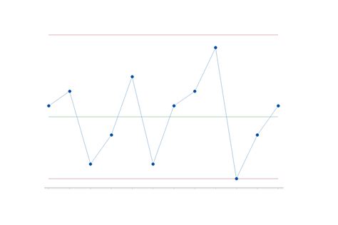
Table of Contents
- A P-chart Would Be Used To Monitor:
- Table of Contents
- A P-Chart Would Be Used To Monitor: Attributes in Proportion
- Understanding Attribute Data and the P-Chart's Role
- What Processes Benefit from P-Chart Monitoring?
- 1. Manufacturing Processes:
- 2. Healthcare:
- 3. Service Industries:
- 4. Other Applications:
- Constructing a P-Chart: A Step-by-Step Guide
- Interpreting a P-Chart: Identifying Out-of-Control Signals
- Limitations of P-Charts and Considerations
- P-Charts vs. Other Control Charts: Choosing the Right Tool
- Latest Posts
- Latest Posts
- Related Post
A P-Chart Would Be Used To Monitor: Attributes in Proportion
A P-chart, a type of control chart used in statistical process control (SPC), is a powerful tool for monitoring the proportion of nonconforming units in a sample. Unlike other control charts that focus on continuous data, the P-chart tackles attribute data, specifically the percentage or proportion of defects or nonconformities within a sample. Understanding when and how to use a P-chart is crucial for maintaining consistent quality and identifying areas for improvement in various processes. This comprehensive guide explores the applications of P-charts, their construction, interpretation, and limitations.
Understanding Attribute Data and the P-Chart's Role
Before delving into the specifics, let's clarify what attribute data represents. Attribute data is qualitative data that categorizes items into distinct classes or attributes. Instead of measuring a continuous variable like weight or length, attribute data focuses on whether an item conforms to specifications or not. This "conformance" is usually expressed as a proportion or percentage. For example, consider a manufacturing process producing light bulbs. The attribute of interest might be whether a bulb is defective (doesn't light) or non-defective (lights). We don't measure the brightness, only the functionality.
The P-chart excels at monitoring this type of data by plotting the proportion of nonconforming units in successive samples. This visual representation allows for quick identification of trends, shifts, and unusual variations in the process, signaling potential problems that need attention.
What Processes Benefit from P-Chart Monitoring?
The versatility of the P-chart makes it applicable across numerous industries and processes. Here are some key areas where it finds extensive use:
1. Manufacturing Processes:
- Defect Rate Monitoring: Tracking the percentage of defective products in batches helps pinpoint issues in the production line, like faulty machinery, inadequate materials, or operator errors. Imagine a bottling plant monitoring the percentage of bottles with leaks. A P-chart would immediately signal a rise in this proportion, prompting investigation into the cause.
- Quality Control Checks: Regular sampling and P-chart analysis ensure adherence to quality standards. This is essential for meeting customer expectations and maintaining brand reputation. A company producing electronics could use a P-chart to monitor the percentage of units failing basic functionality tests.
- Process Capability Analysis: By analyzing the control chart, businesses can determine if their processes are capable of meeting predefined quality specifications. A consistently low defect rate indicated by a stable P-chart demonstrates a capable process.
2. Healthcare:
- Infection Rates: In hospitals, P-charts monitor the proportion of patients contracting hospital-acquired infections. Tracking these rates across different wards or over time helps implement effective infection control measures.
- Medication Errors: Monitoring the proportion of medication errors can highlight areas needing improvement in prescribing, dispensing, or administration.
- Patient Satisfaction: While often measured with scores, satisfaction can be categorized (e.g., satisfied/unsatisfied). A P-chart can track the proportion of satisfied patients, signaling trends in service quality.
3. Service Industries:
- Customer Complaints: The percentage of customers filing complaints can be monitored using a P-chart. A sudden spike can signal a need to address customer service issues or product defects.
- Order Accuracy: In restaurants or online retail, a P-chart can track the proportion of orders filled accurately. This highlights potential problems in order processing or fulfillment.
- Service Errors: Any service industry dealing with measurable errors (e.g., wrong information provided, missed appointments) can benefit from P-chart monitoring.
4. Other Applications:
- Defect Detection in Software Development: The proportion of bugs found in software releases can be tracked to assess the effectiveness of testing and development processes.
- Compliance Monitoring: Tracking the proportion of instances meeting regulatory compliance requirements helps identify areas needing improvement.
- Data Entry Accuracy: Monitoring the percentage of data entry errors in a large database helps maintain data quality and integrity.
Constructing a P-Chart: A Step-by-Step Guide
Creating a P-chart involves several key steps:
-
Define the Attribute: Clearly define the characteristic you are measuring (e.g., defective units, incorrect entries).
-
Determine Sample Size: Choose a consistent sample size (n) for each subgroup. The sample size should be large enough to provide meaningful data but practical to collect. A larger sample size leads to more precise estimates but incurs higher costs.
-
Collect Data: Collect data on the number of nonconforming units (x) in each sample. Record this data for a sufficient number of subgroups (at least 20-25 is recommended to establish a baseline).
-
Calculate the Proportion of Nonconforming Units (p): For each sample, calculate the proportion of nonconforming units as p = x/n.
-
Calculate the Average Proportion of Nonconforming Units (p-bar): This is the average of all the sample proportions (p) calculated in the previous step. This represents the central tendency of your process.
-
Calculate the Standard Deviation (σ): The standard deviation for a P-chart is calculated using the formula: σ = √[p-bar(1 - p-bar) / n]. This measures the variability of the process.
-
Establish Control Limits: The control limits are calculated as follows:
- Upper Control Limit (UCL): p-bar + 3σ
- Central Line (CL): p-bar
- Lower Control Limit (LCL): p-bar - 3σ
Note: If the calculated LCL is negative, it's conventionally set to 0 since a proportion cannot be negative.
-
Plot the Data: Plot the sample proportions (p) on a graph with the sample number on the x-axis and the proportion on the y-axis. Draw the central line and the upper and lower control limits on the graph.
Interpreting a P-Chart: Identifying Out-of-Control Signals
Once the P-chart is constructed, interpreting the plotted points is crucial for identifying potential issues. Points falling outside the control limits are considered out-of-control signals, indicating a significant shift or variation in the process. These signals warrant investigation to determine the root cause.
Beyond points outside the control limits, several other patterns can indicate potential problems:
- Trends: A consistent upward or downward trend suggests a gradual shift in the process, possibly due to wear and tear on equipment or changes in materials.
- Cycles: Recurring patterns of high and low proportions indicate periodic fluctuations in the process, possibly related to operator shifts or weekly cycles.
- Stratification: Clustering of points above or below the central line indicates inconsistencies in the data or subgroups.
- Runs: A series of consecutive points above or below the central line, even if within the control limits, suggests an underlying issue that might warrant further investigation.
Limitations of P-Charts and Considerations
While P-charts are valuable tools, they have certain limitations:
- Assumption of Constant Sample Size: P-charts assume a constant sample size (n) across all subgroups. Variations in sample size can lead to inaccurate control limits.
- Sensitivity to Small Sample Sizes: With very small sample sizes, the control limits may be overly wide, making it less sensitive to real shifts in the process.
- Independence of Samples: The effectiveness of the P-chart relies on the assumption that the samples are independent. If samples are correlated (e.g., consecutive units produced on the same machine), this assumption is violated, affecting the accuracy of the analysis.
- Ignoring the Nature of Defects: The P-chart simply counts the number of defects; it doesn't provide insights into the types of defects or their root causes. This often necessitates supplemental analysis to identify corrective actions.
P-Charts vs. Other Control Charts: Choosing the Right Tool
The choice of control chart depends on the type of data being analyzed. Here's a comparison of P-charts with other commonly used charts:
- P-chart vs. np-chart: Both monitor attribute data, but the np-chart is used when the sample size (n) is constant, while the P-chart is more flexible and can handle variable sample sizes.
- P-chart vs. c-chart: The c-chart monitors the number of defects per unit, whereas the P-chart tracks the proportion of nonconforming units in a sample.
- P-chart vs. u-chart: Similar to the c-chart, the u-chart monitors the number of defects per unit but is designed for varying sample sizes.
In conclusion, the P-chart is a valuable tool for monitoring the proportion of nonconforming units in a process. Its ability to visually represent process variability and promptly signal potential issues makes it a cornerstone of quality control across diverse industries. However, understanding its limitations and correctly interpreting the results is crucial for effective application and achieving process improvement. Remember that the P-chart is just one piece of the puzzle; combining it with root cause analysis and other quality management techniques can lead to significant improvements in process efficiency and product quality.
Latest Posts
Latest Posts
-
How Much Is 71 Kilos In Pounds
May 19, 2025
-
157 Cm To Feet And Inches
May 19, 2025
-
How Many Kg Is 195 Lbs
May 19, 2025
-
79 Inches Is How Many Feet
May 19, 2025
-
How Much Pounds Is 71 Kg
May 19, 2025
Related Post
Thank you for visiting our website which covers about A P-chart Would Be Used To Monitor: . We hope the information provided has been useful to you. Feel free to contact us if you have any questions or need further assistance. See you next time and don't miss to bookmark.